

Building Computer Skills to Enable Success
Building Computer Skills to Enable Success
If you’ve ever watched someone draw boxes and arrows in PowerPoint like they’re planning a small military operation, you’ll know exactly why SmartArt exists. (Maybe that person is you! Just saying.) I’ve seen people spend longer trying to line up a bunch of shapes than they spend preparing for the actual presentation or meeting. The thing is that in most cases, they don’t even realise that PowerPoint (and Word) can build professional looking diagrams in just a few clicks.
This is where SmartArt comes to the rescue.
It’s one of those features that often just sits in the Ribbon, feeling unloved, waiting to save you time, reduce your stress levels, and make your slides look far more professional.
In this article, I’ll show you how SmartArt works, when to use it, and how to avoid the common traps that lead to messy, inconsistent visuals. Plus, I’ll share three practical examples you can try out to get you up and running, including a Venn diagram, a simple list diagram, and an organisation chart.
Let’s get started.
What SmartArt Actually Does (and Why You Should Care)
SmartArt gives you ready-made diagram layouts that automatically adjust and format themselves while you type. No more fiddling with boxes, resizing shapes, or nudging arrows pixel by pixel with your tongue poked out to the left (tell me I’m not the only one!)
You can use SmartArt to:
- Show relationships
- Illustrate processes
- Display hierarchies
- Compare options
- Clarify complicated text
- Bring structure to your story
One of the biggest hidden benefits is that your diagrams stay consistent, with the fonts, spacing, colours, and alignment all handled for you. It’s like having a professional designer helping you along and keeping things tidy while you focus on the content of your presentation. (Which is what you should be doing anyway, right?)
SmartArt works in PowerPoint, Word, Outlook, and even in Excel if you really want (although PowerPoint is its natural habitat).
Why People Avoid SmartArt
In my training sessions, I often ask people why they’re drawing everything manually. The answers are usually something like:
- “I didn’t know SmartArt existed.”
- “I thought it was difficult.”
- “I didn’t realise you could convert bullet points into SmartArt.”
The thing is, SmartArt isn’t difficult, it’s just a feature most people never explore.
Once you know the basics, it can be one of the quickest ways to improve your slides.
Creating Your First SmartArt Graphic
Start from scratch
- Open PowerPoint and select the slide where you want your diagram.
- Select Insert > SmartArt.
- Choose a category from the left (e.g. List, Process, Cycle, Hierarchy, Relationship, Matrix, etc.).
- Pick a layout that suits your message and click OK.

You’ll now see the diagram appear on your slide with a text pane open to the left. You can start typing your information into the text pane, or directly into the diagram shapes, and the diagram will adjust as you go.
Tip: If the text pane isn’t visible, click the small arrow on the centre left of the diagram to open it.
Convert a bullet list into SmartArt
I love this one. If you already have a bullet list on your slide, (let’s face it, who doesn’t?), you can quickly convert it to a diagram.
- Click inside your list.
- Go to Home > Convert to SmartArt.
- Hover over the options to preview them live on your slide.
- Choose one that fits your message.
Before

After

This option saves stacks of time and is great when you want to start visualising ideas without recreating everything from scratch.
In fact, I recently showed this feature when delivering a PowerPoint training session to a client and I saw a participant with that look that says, “You’ve got to be kidding me, I spent ages retyping and reformatting my list into a nice graphic, and you just did it in 5 seconds”! (I can’t repeat the actual words, not in polite company)!
Practical Workplace Examples
Below are three examples you can drop into your next presentation, along with step-by-step instructions your next presentation.
Example 1: Venn Diagram
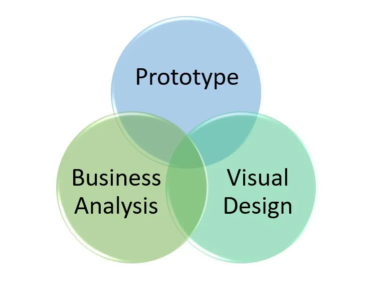
Venn diagrams are brilliant for showing shared responsibilities, overlapping features, or areas that require collaboration between groups.
How to create a Venn Diagram
- Go to Insert > SmartArt.
- Choose Relationship.
- Select Basic Venn.
- Type your labels into the text pane.
- Resize the diagram to make space for overlaps.
When to use
- Comparing two product features
- Showing collaboration between departments
- Highlighting shared goals in a project
Bonus Tip
Try using the SmartArt Design tab to switch colour schemes. A subtle theme change can make groups easier to distinguish without overwhelming the slide.
Example 2: List Diagram
List diagrams are ideal when you need to outline simple information but want something more visually interesting than bullet points.
How to create a List Diagram
- Start with a slide containing your list.
- Select the text.
- Select Home > Convert to SmartArt.
- Choose a layout such as Vertical Block List or Horizontal Bullet List.

When to use
- Steps in a process
- Meeting agenda items
- Key points in a summary
- A checklist you want displayed more clearly
Bonus tip
If you change your mind, you can use the Convert button on the SmartArt Design ribbon to convert your diagram back to text. Handy when experimenting.
Example 3: Organisation Chart
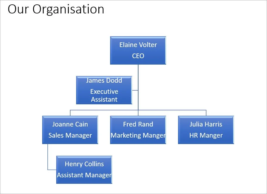
Org charts are one of the most common workplace diagrams people still draw manually. It’s painful to watch when you know that SmartArt can do the entire job for you.
How to create an Org Chart
- Go to Insert > SmartArt.
- Select Hierarchy.
- Pick Organisation Chart.
- Use the text pane to add names and job titles.
- Press Enter to add more roles, and Tab to create sub-levels.
When to use
- Showing your team structure
- Demonstrating reporting lines in a project
- Explaining who’s responsible for which areas
Bonus tip
Use SmartArt Design > Create Graphic to add assistants, move roles up/down, or change the layout style.
Formatting, Styling, and a Few Hidden Tricks
Once your SmartArt diagram is on the slide, you’ll see two new tabs:
- SmartArt Design
- Format
This is where you can:
- Change the layout
- Switch colour schemes
- Apply SmartArt Styles (such as bevels or drop shadows)
- Add or remove shapes
- Reorder content
- Convert SmartArt into regular shapes
That last one is especially powerful.
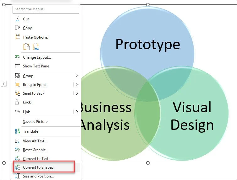
Convert SmartArt to shapes (for full editing freedom)
- Right-click your SmartArt graphic.
- Choose Convert to Shapes.
This breaks the diagram apart so you can edit each element individually; great when you want the layout SmartArt gave you but prefer your own creative touches.
SmartArt in Word — A Quick Note
Although PowerPoint is usually the best place for SmartArt, don’t forget that Word also supports it. The steps are identical:
Insert > SmartArt > Pick a layout > Type.
This is especially useful for:
- Reports
- Internal guides
- Policies
- Procedures
- Client documentation
If you’ve been manually drawing diagrams in Word, SmartArt can save you a surprising amount of time.
Common Mistakes to Avoid
Even though SmartArt makes life easier, there are a few things to keep in mind:
- Don’t overload diagrams – less is more.
- Avoid tiny fonts – resize the whole graphic instead.
- Choose the right layout for your message – don’t force a process into a hierarchy layout.
- Keep colours consistent – use theme colours, not random ones from the palette.
- Don’t stretch shapes unnaturally – let SmartArt handle proportions.
If you stick to these, your slides will always look cleaner.
Conclusion
SmartArt is one of the quickest ways to turn plain text into engaging professional visuals. Once you get used to it, you won’t want to go back to manually drawing shapes and arrows. Whether you’re comparing options with a Venn diagram, turning a boring bullet point list into something clearer, or showing your team structure with a tidy org chart, SmartArt can save you time and help you get your message across more effectively.
Give it a go in your next presentation or Word document. You might even hear someone say, “Wow, how did you do that?” (And you have my permission to smile the smile of the smug, knowing it took you about 20 seconds.)